Privecursus
What we did
Industry
Private tutoring
Description
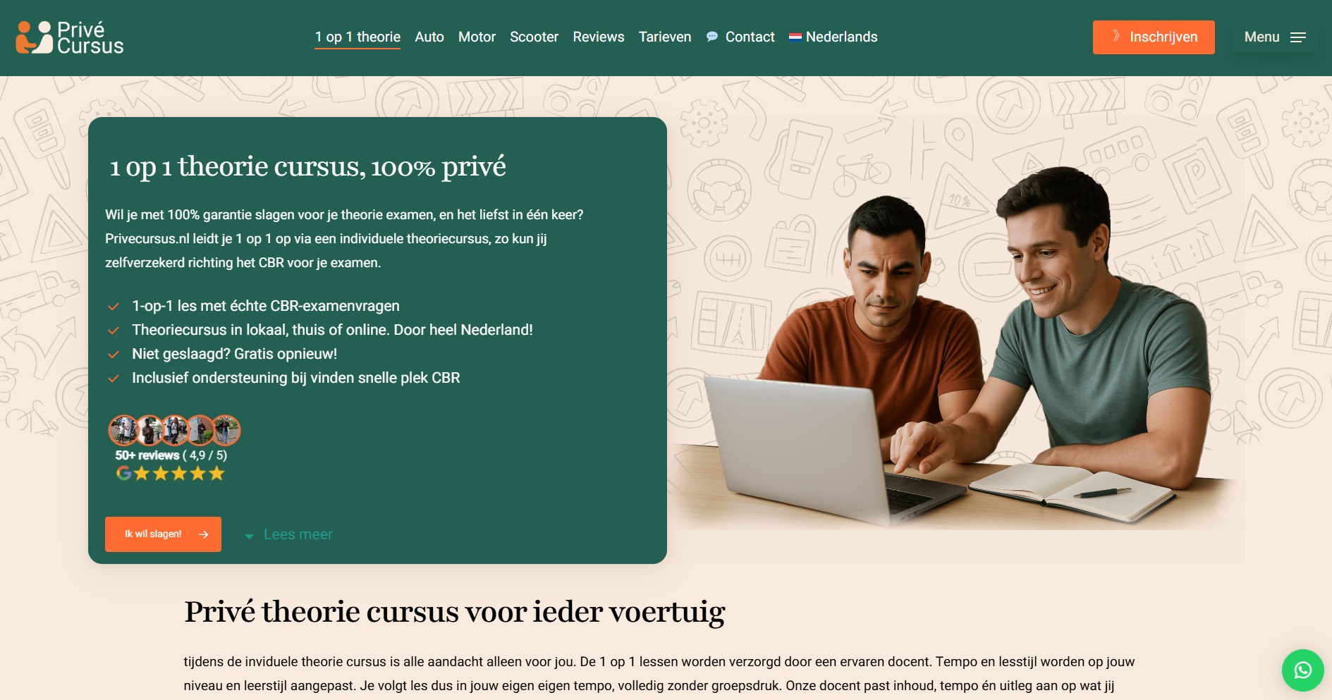
We partnered with Privecursus.nl to create a brand identity that feels calm, supportive, and centered on true 1-on-1 attention. The client wanted a visual experience that helps students feel safe and confident while preparing for their CBR theory exam.
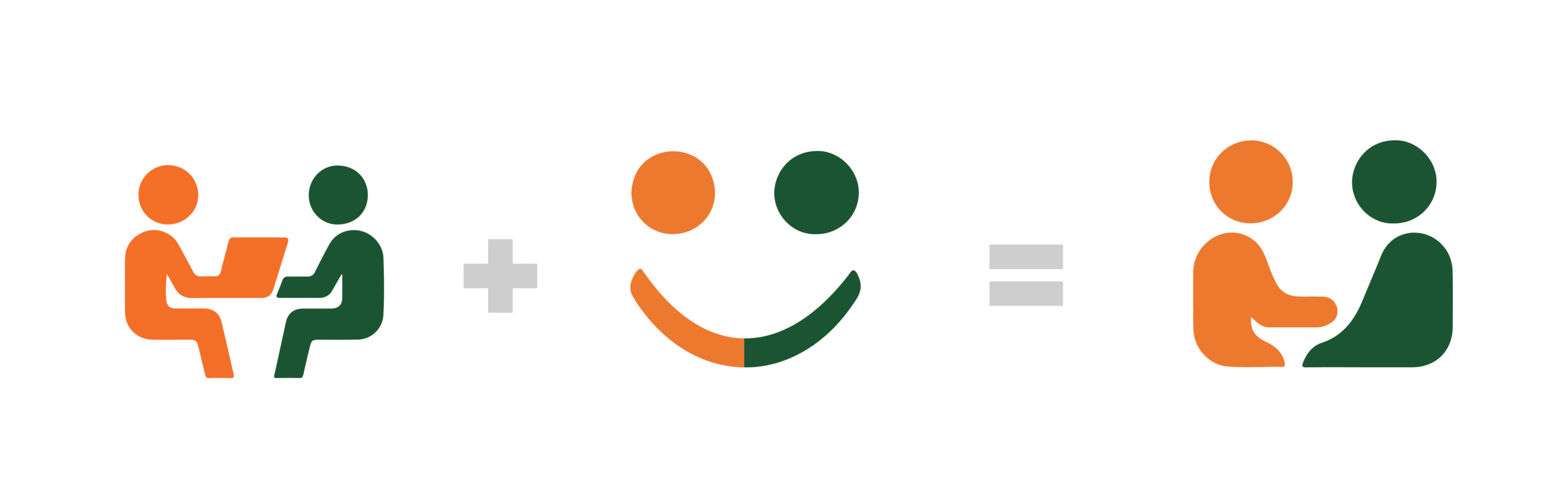
The identity is built on a deep green palette that communicates stability, clarity, and focus. Their logo, made from two simple figures forming a friendly smiling face, became the core symbol of the brand. It reflects the comfort of personal guidance and the warmth of a private learning environment. Rounded typography adds approachability, while subtle orange accents introduce motivation and a sense of progression.
Imagery highlights relaxed, real-life study moments, showing how individual attention creates trust and ease throughout the learning journey. Every element supports the message that students are never alone in the process.
The final brand feels warm, human, and reassuring, with a character that invites students to learn with confidence.