Slijterij van Gils
What we did
Industry
Beverages and Retail
Description
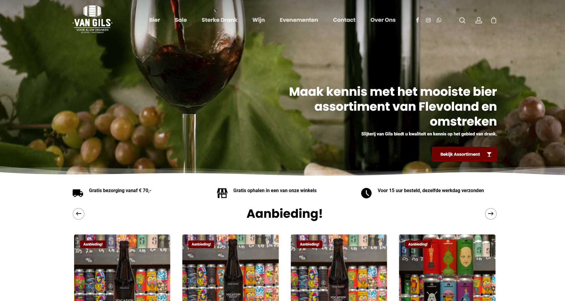
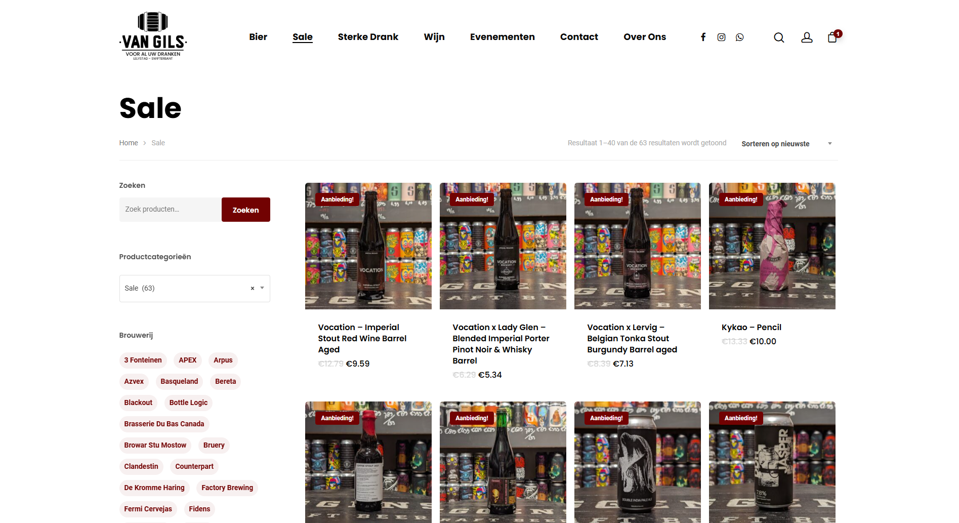
Slijterij van Gils asked us for a clean, product-first website that highlights their wide range of beers, wines, and spirits without unnecessary text. They wanted a look that feels rich and warm, inspired by the deep tones found in wine cellars and aged bottles.
We used a dark crimson red, close to the color of full-bodied red wine, as the primary accent. It brings a sense of depth and tradition to the brand while staying true to their craft. The rest of the palette stays crisp with white backgrounds and black typography to keep the focus firmly on the products. This contrast makes every bottle stand out clearly and gives the whole shop a fresh, organized feel.
The layout is minimal and direct, leading visitors straight into the assortment without distractions. Product cards, categories, and offers take center stage so customers can browse quickly and comfortably.
The final identity feels warm, classic, and product driven, presenting Slijterij van Gils in a way that is both modern and true to their roots.
“Thanks to this teams hard work and expertise, my website has seen a significant increase in online traffic and customer engagement. I would recommend Clean to anyone and any business looking to improve their marketing efforts without a fuss. Five stars!”
Sem van GilsCo-founder Slijterij van Gils